Noble Venue Portal
Empowering venues to make the most of every night
Noble allows venues to provide mobile ordering of food and beverages. Their product suite includes a consumer app, a bartender app, and a web-based venue management portal. I was tasked with designing the mobile experience, allowing managers to check-in on nightly stats while running the floor.
This project has been handed-off and is currently in development.
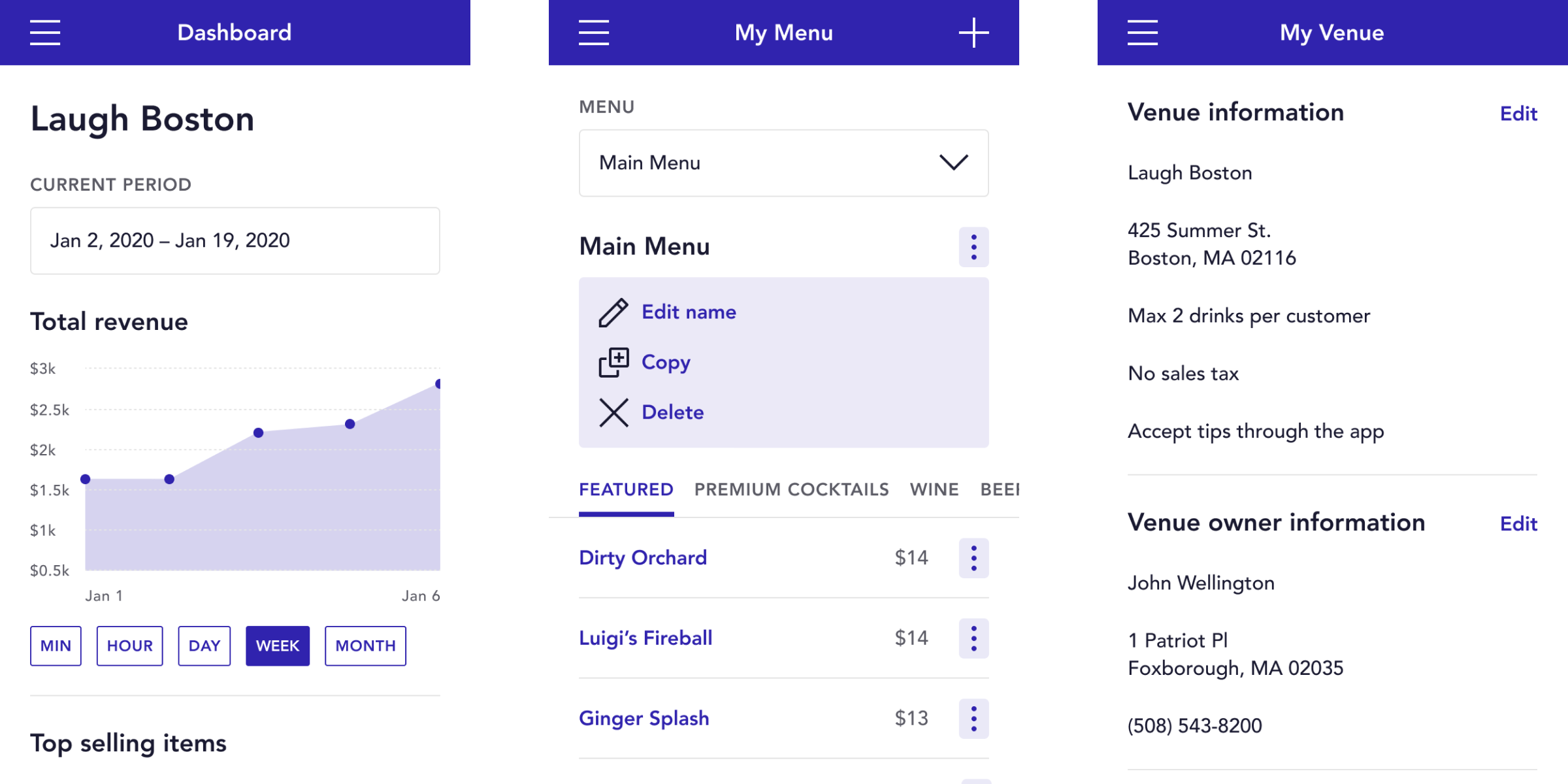
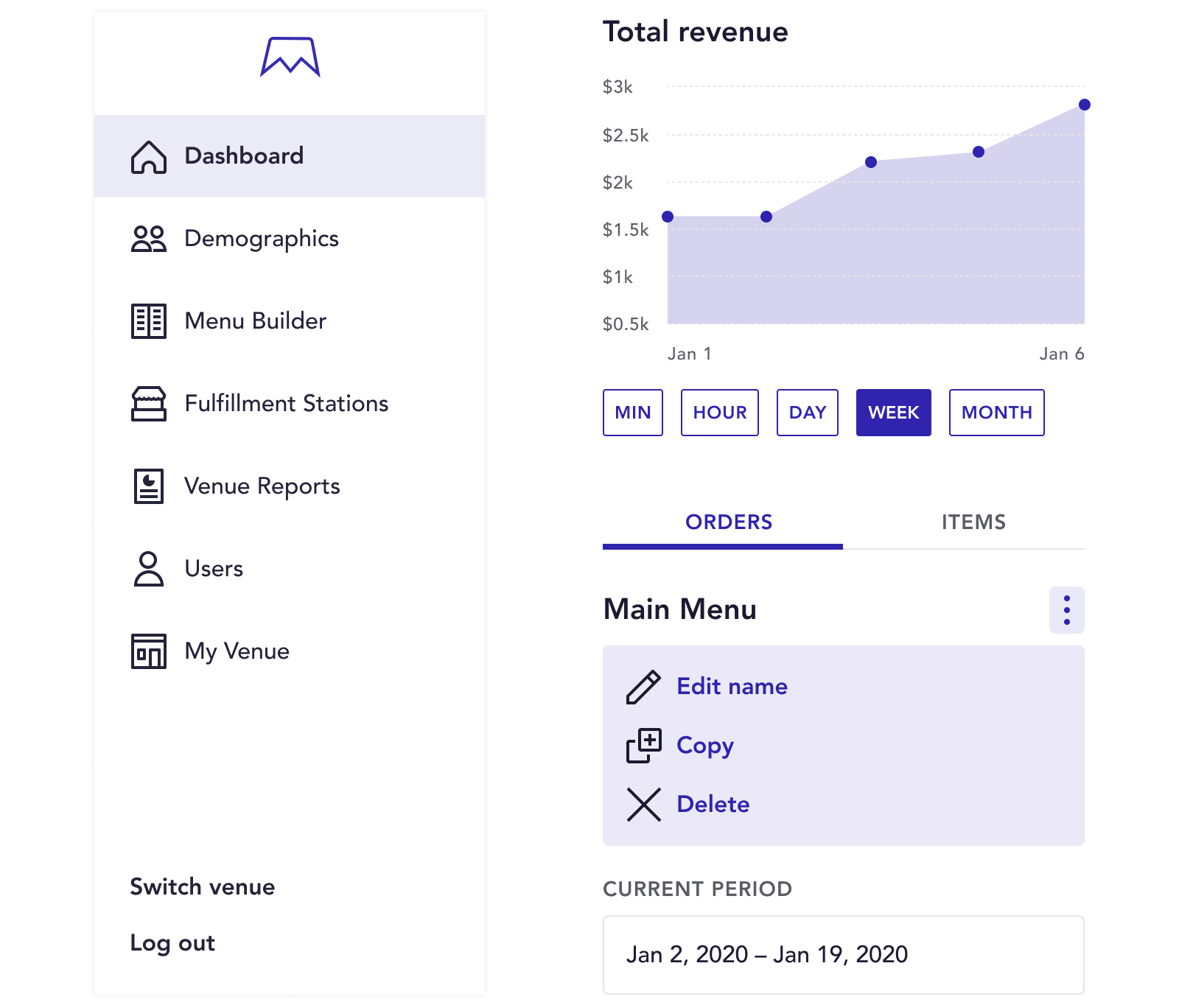
The desired outcome was a mobile-friendly treatment that didn’t compromise any functionality from the desktop experience. None of the flows or functionality would change, but there was room to adjust the UI and make quality-of-life improvements.
The design system would reside within the team's new Figma account and would continuously be updated as the portal evolved.
Conducting an audit of all the unique components in the Venue Portal allowed me to isolate the different use-cases I needed to take into account. Using my findings, I could identify which elements could be turned into universal components and which might require a more tailored solution.
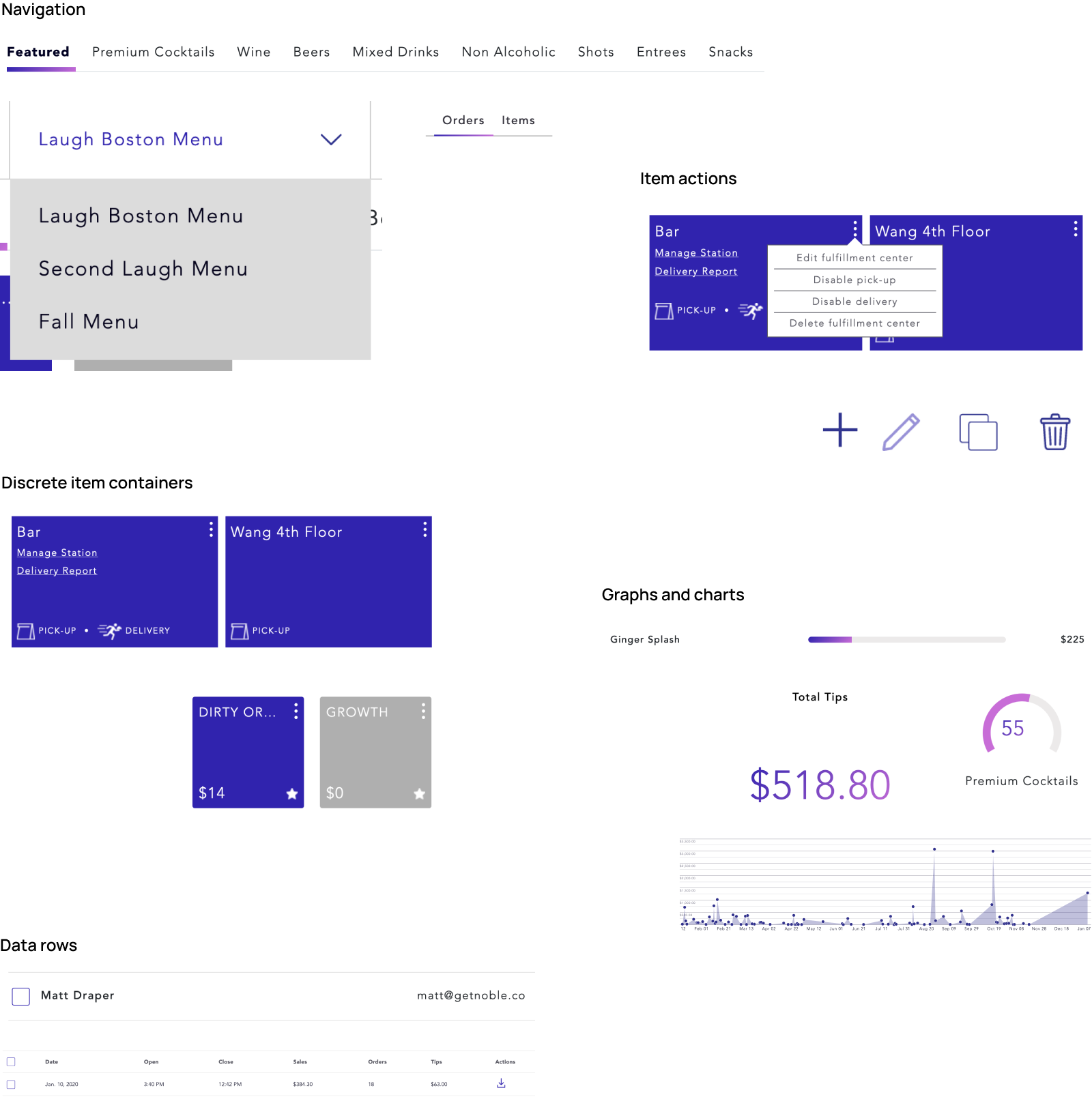
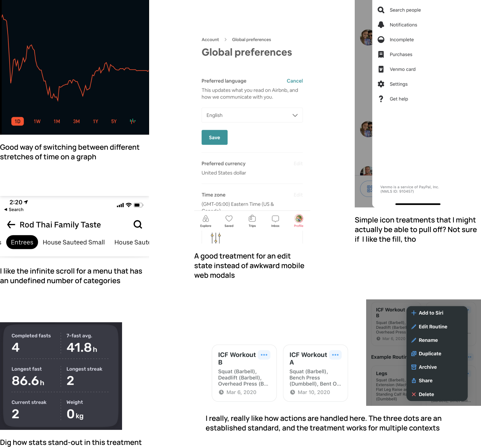
Not every component would easily translate from desktop to a smaller screen. Taking what I learned from the component audit, I pulled examples of patterns that might apply to the Venue Portal. I collected as many examples as possible to save time later in the visual design process.
Noble stands out in part to a unique and vivid blue-magenta gradient, but it needed to be used sparingly. The base blue was relegated to all actionable elements. This included buttons, links, tabs, and anything other clickable or tappable elements.
For variation, I provided the option to use shades of the blue at either 10%, 20%, or 40% opacity. A black, a dark gray, and a light grey were set as standards for text and line dividers.
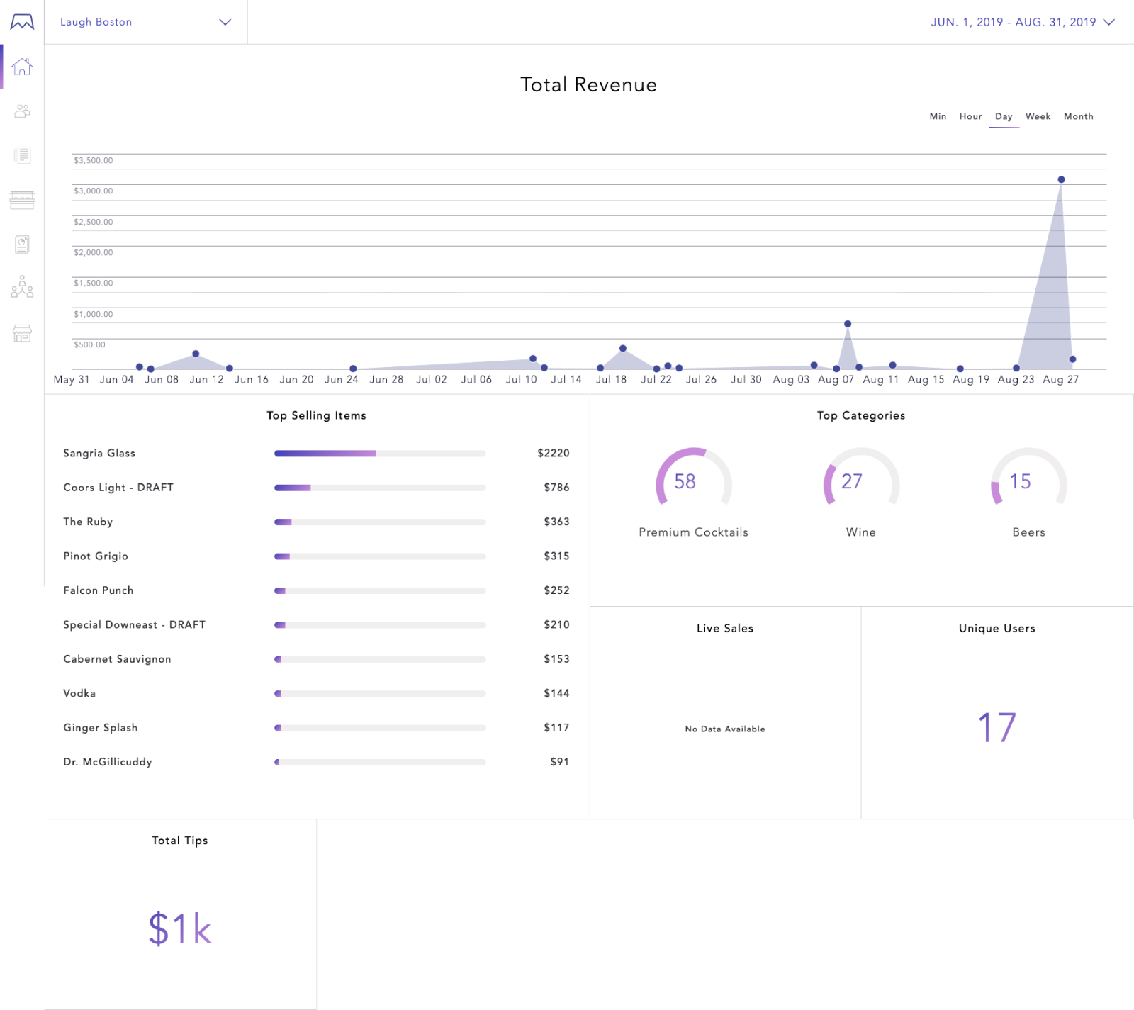
The gradient was reserved for high impact visuals such as bar graphs, doughnut charts, and stat values.
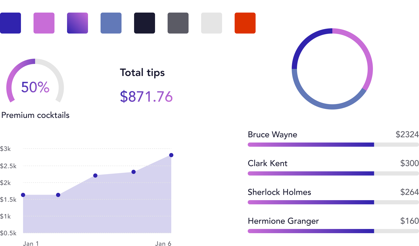
Wherever possible, I allowed type and white space to do the heavy lifting. Heavy-weight headers to allow managers to easily distinguish between sections. Body copy set to 16pt prevents squinting. Established text styles ensure similar-themed content looked consistent across all pages.
If a component couldn't be easily and intuitively translated to mobile, it was rethought entirely.
Long menus were turned into horizontally scrolling tabs. Page layouts were converted to easy-to-scan lists. And item actions were placed into contextual menus, to name a few of the updates.
Taking a page from really every other design system out there, spacing is based on a square 8-pixel unit. The occasional 4-pixel exception is made for smaller elements.
Column layouts were standardized to ensure conistent spacing across entire pages.
Up to this point, we had been sourcing icons from the Noun Project which, while a great resource, made it difficult to 1) find specific icons and 2) maintain a consistent style. The team indulged me and allowed me to begin a custom icon library based on a 24px grid.
Properly labeling files, sticking to rules, and creating reusable styles early kept me from getting lost and producing inconsistent work. It's heart-wrenching to update a label's font size and realize you never made it a component.
Setting goals, sourcing examples, and taking notes at the beginning of a project makes everything else way easier and more fun later down the line. The component audit and competitive analysis were especially helpful, saving me hours spent trying to find that one example that I swear is in one of these tabs...
Back to top