Broad Geos
Introducing new destinations to travelers on Tripadvisor Flights
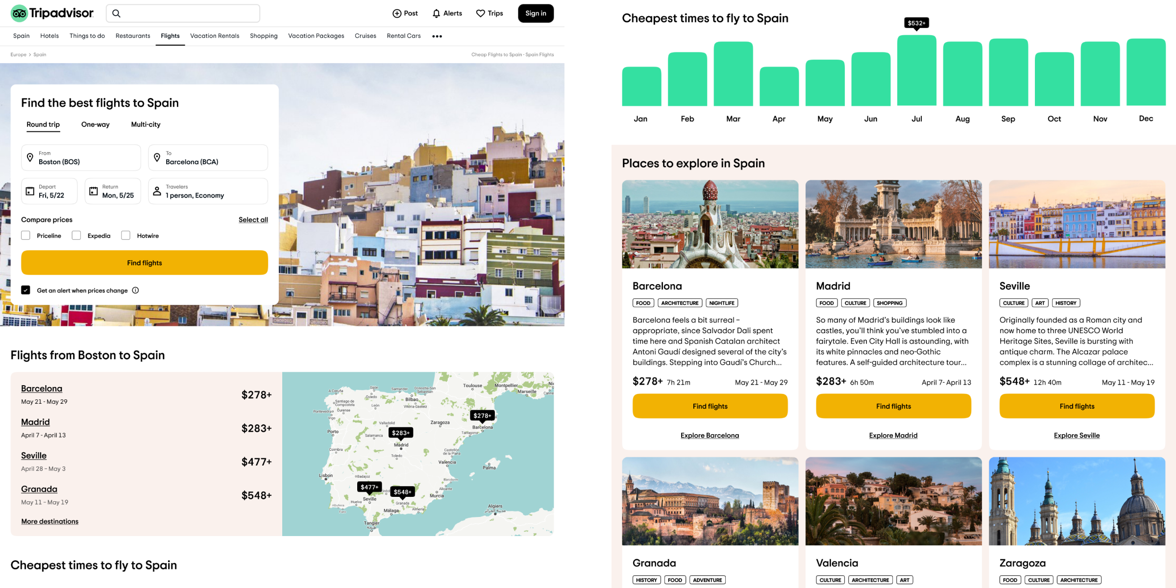
Broad Geos are dynamic landing pages allowing users to search for flights across a broad geographical area such as Spain or Europe. Prior to this product, Tripadvisor Flights could only serve up relevant travel content for one destination at a time.
This project resulted in an 2.82% increase in search rate and a 5.42% decrease in bounce rate.
The majority of Tripadvisor Flight's traffic comes from search engine queries. If a traveler searched for flights to Barcelona and clicked on Tripadvisor's result, they would be brought to a landing page filled with Barcelona-related content. This is great if they've already decided on their trip destination.
But what if they weren't sure? Maybe they wanted to search for flights all across Spain? Or across Europe? Users needed a way to search for flights and compare destinations at a broader scale.
From a design standpoint, we wanted early-stage planners to feel better-informed during the planning process.
From a business standpoint, we wanted to see an increase in searches for flights, flight bookings, time spent on our pages, and retention.
Before a single pixel was placed, my product manager and I put together an open-ended user survey. Using the tools of their choice, we asked 16 participants on UserTesting.com to walk us through their process for planning a trip requiring airfare. We came away with these key takeaways.
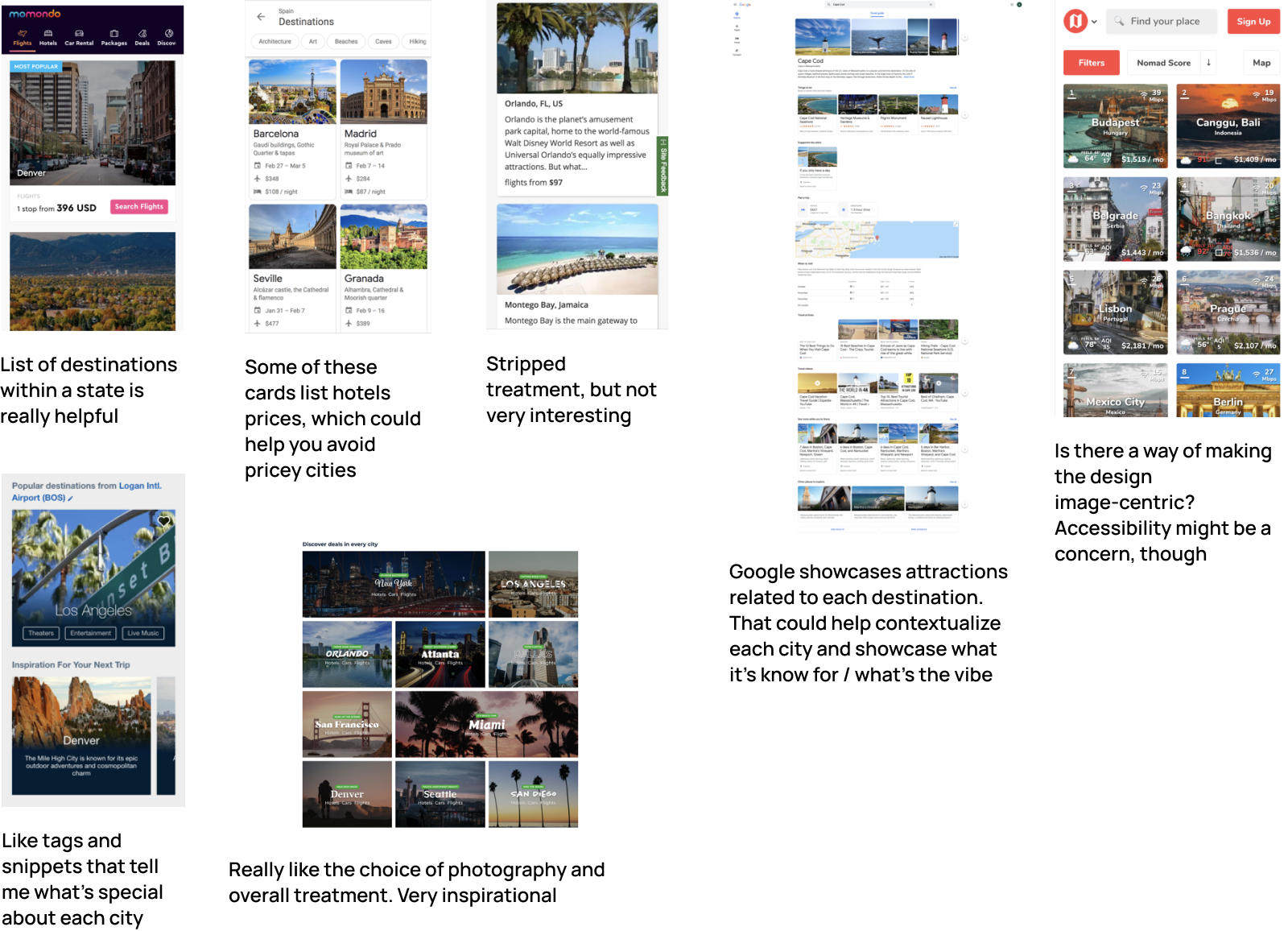
A day was spent collecting and documenting examples of of similar projects from other players in the travel space.
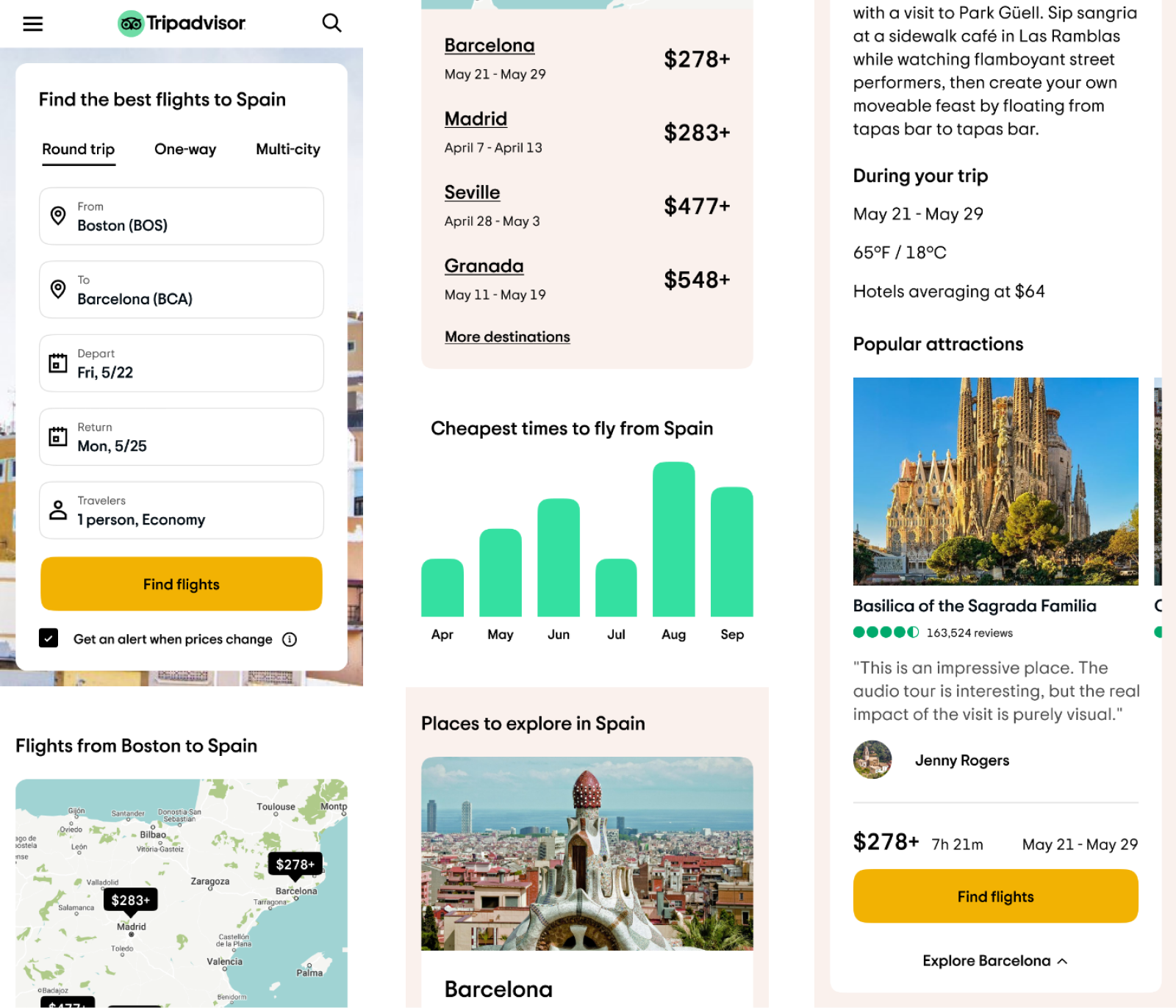
A brand new landing page treatment filled with content based on user survey and user testing results, allowing users to quickly compare cities, explore attractions, find fare estimates, and narrow down the best times to travel.
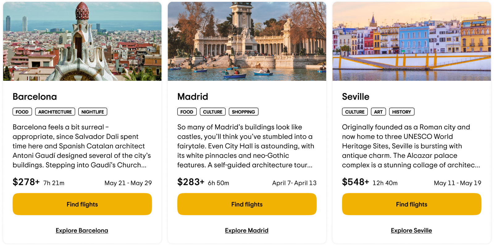
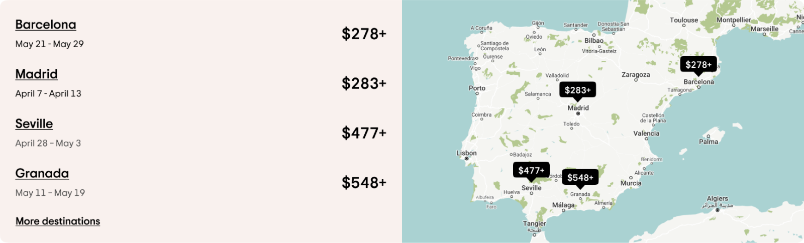
Participants in the open-ended survey sometimes struggled to find a city that would match their trip style. City cards allow travelers to quickly browse and narrow in on their ideal destinations.
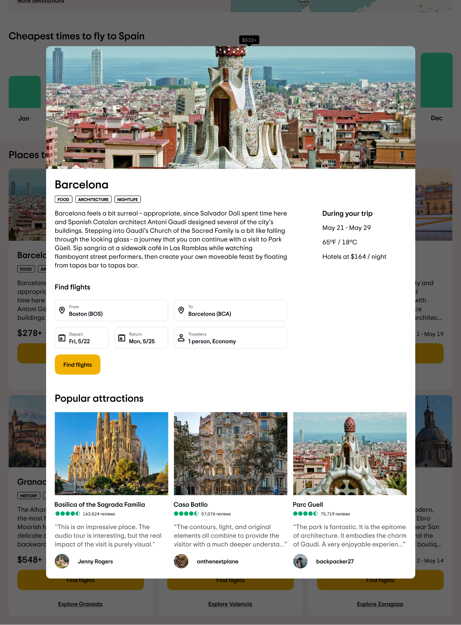
Clicking the text link at the bottom expands the card into a modal with additional information regarding weather, hotel rates, and popular attractions.
When we first tested the city cards, participants expressed frustration at not being able to easily view flight prices across destinations. The destination map allows users to easily scan and compare fares while orientating themselves on a map.
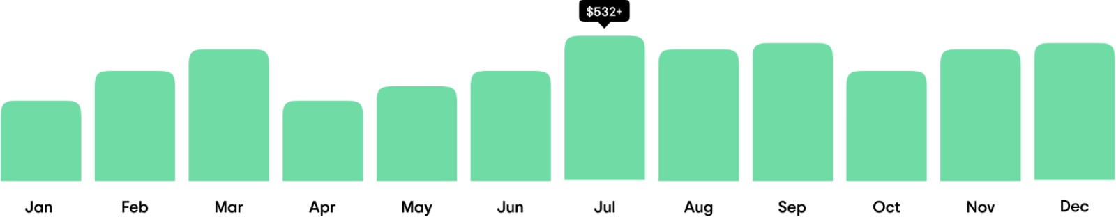
We also heard demand for a way to view cheapest times to fly. The price graph uses the prior year's data to determine which months had the lowest fares.
A major theme behind this endeavour was inspiration. We heard from travelers themselves that photography plays a role in choosing their destination. However, our old search form felt like a relic from the early 2000s.
A/B testing crowned this new treatment as the winner. We compressed the form, using the leftover space to showcase the destination with vivid imagery.
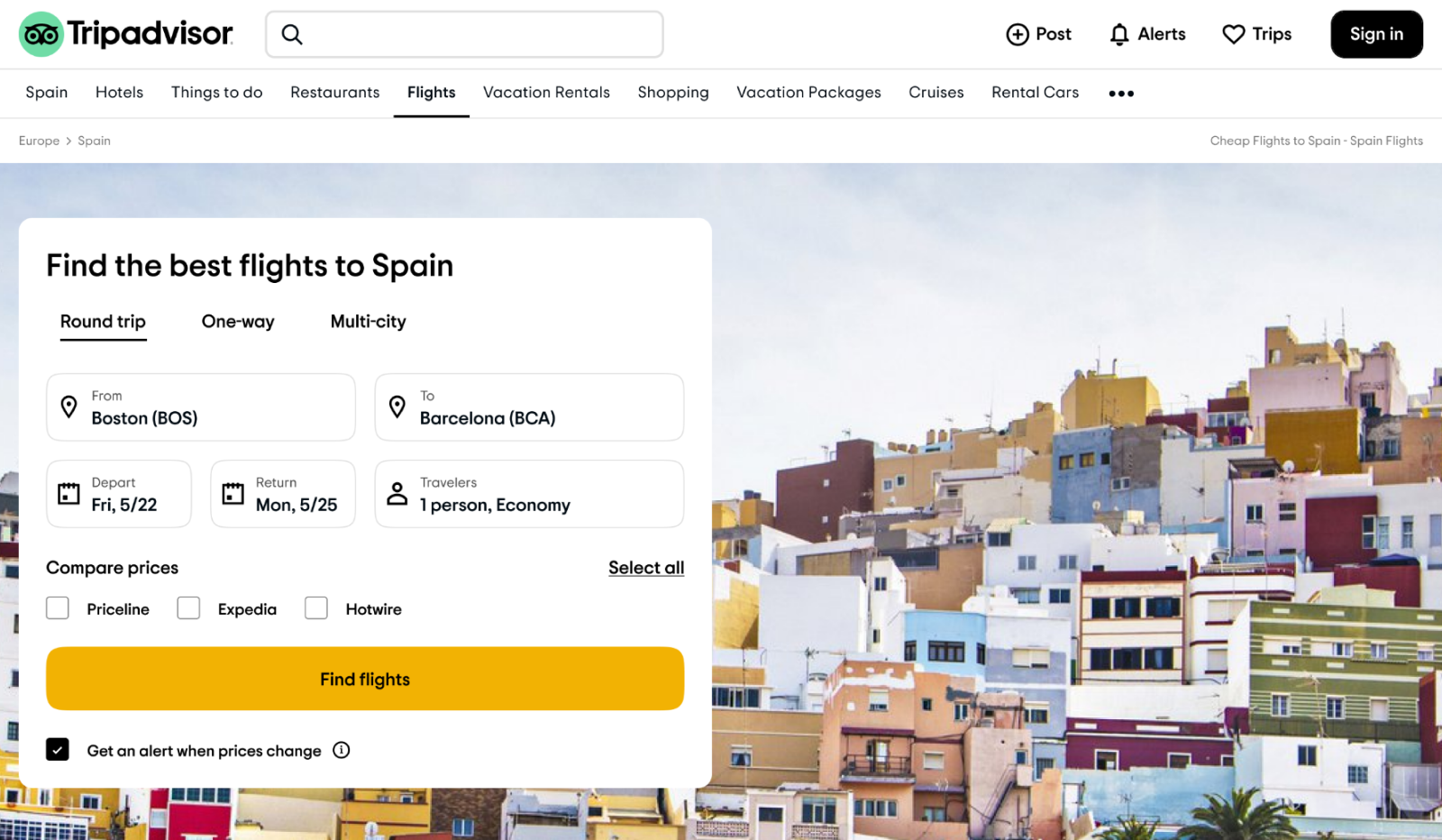
Due to our traffic skewing mobile, this project was designed mobile first before being adapted to tablet and desktop.
Had we decided to jump into design without running the initial survey or validating our concepts, we would've missed on a lot of key findings that pushed the project forward. A quick example: Lots of people didn't know Spain was cold in March, hence the weather display.
It may seem obvious, but the better equipped a user is, the more successful they'll be at their task. While they loved the captivating imagery and city descriptions, many travelers were excited to see the addition of lists, maps, and charts.
Back to top