Design Systems & Data
Making content impactful with Knotch
Knotch is a marketing analytics platform that helps organizations determine if their content, which can range from blog posts to resource centers, is driving business objectives.
During my time at Knotch, I developed a design system that increased design efficiency by 37% and increased engineering efficiency by 16%.
I also developed and shipped multiple new features that were brand new to the platform, laying the foundation for Knotch's next-gen platform: Knotch Pro.
When I joined Knotch, they were beginning to shift resources away from Measurement, their legacy platform, and invest more time and money into the next iteration of the product: Knotch Pro.
Most of the backend work had already been done, but in terms of user experience and visual design, Knotch Pro was a blank slate.
Since the team was building a brand new platform from the ground-up, there would be some brand work baked into building the design system.
I decided to conduct a heuristic and aesthetic evaluation of the legacy platform. This would allow me to get a sense of what components we needed along with some ideas on how to style future elements.
I asked myself, what did I like about the platform? What did I hate? What visuals stylings were fun and tied to the company's brand? What looked outdated and a little too unconventional? These were the main takeaways.
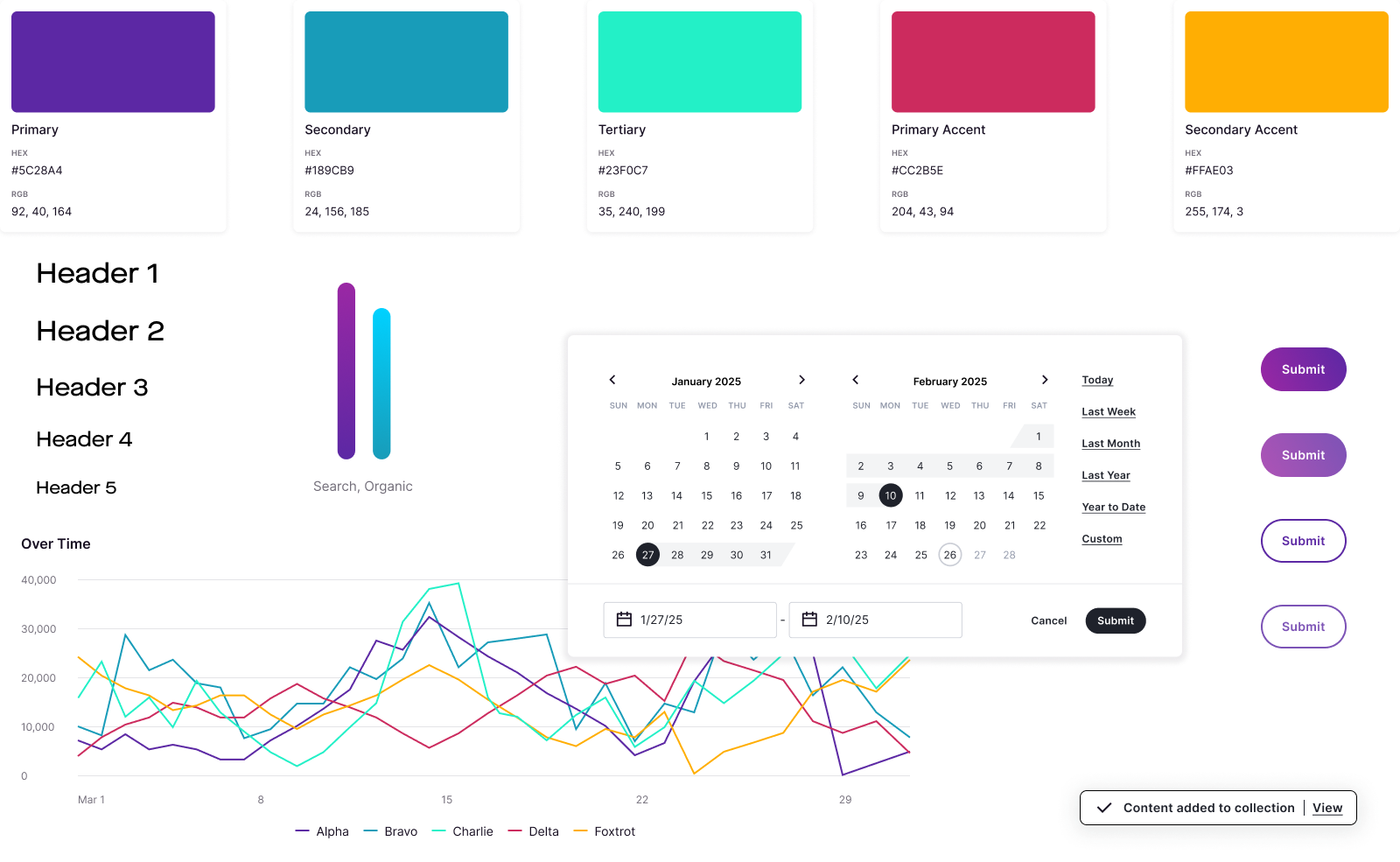
Work on design systems is a massive undertaking that never truly ends. But you need to start with a foundation. My first order of business was setting up a column-grid system. Nothing fancy, just a responsive 12 column-grid with a max-width of 1440px, our largest breakpoint.
Right, we also needed breakpoints. 1440px, 1280px, and 1024px.
After that, headline and body fonts. The design team settled on Maison for headlines and Inter for copy. I stress-tested them to ensure they'd work in the various contexts we were imagining.
And finally, we needed colors. After going through 67+ palettes, I finally developed a set that was flexible, accessible, and matched the brand direction set by the co-founder.
After the groundwork was set (which involved pulling in an icon library, creating a spacing system, and making a few other atomic elements), every addition to the design system thereafter was made alongside feature work.
A project needed tabs? Design as a standalone component, test it, and add it to the library. We need an error module? Same deal. Design it, document it, test it, and toss it in with all the rest.
I wanted to make sure accessibility was a core requirement and not a nice-to-have. In addition to accessible color and font-sizes, I ensured images were uploaded with alt-text, labels were descriptive, interactive elements had aria-labels, and the platform could be navigated with a keyboard alone.
It should go without saying that the front-end engineering team were instrumental in bringing the design system to life. Countless conversations filled with thoughtful feedback, great ideas, and healthy pushback positively influenced every aspect of the project.
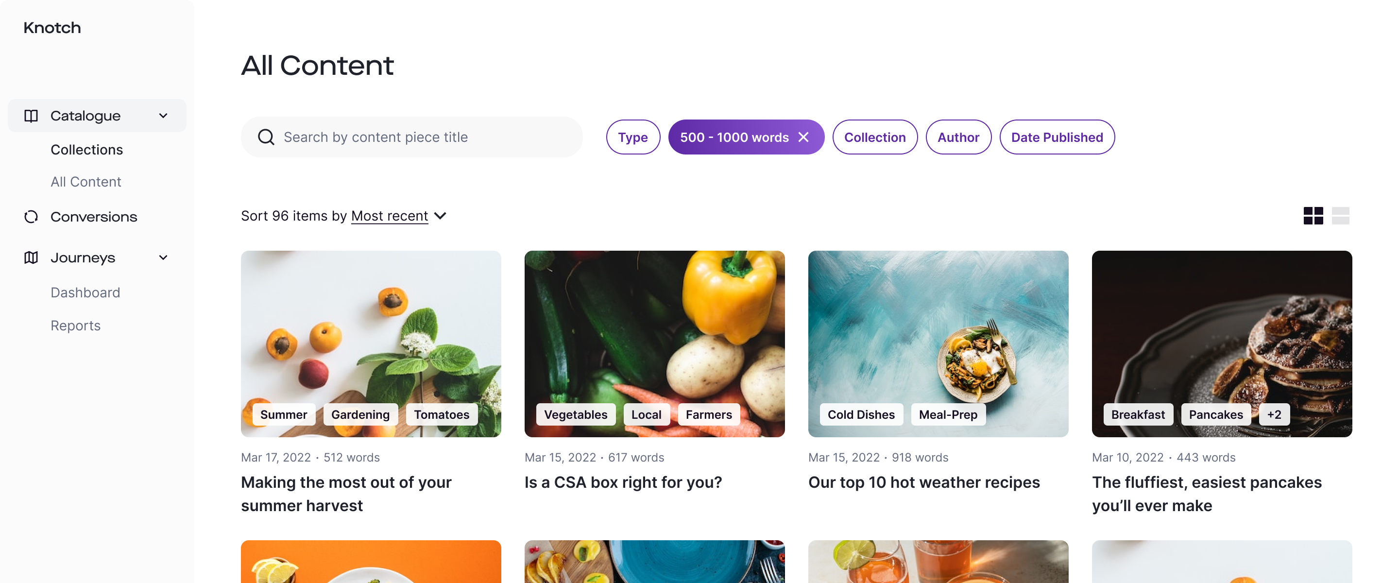
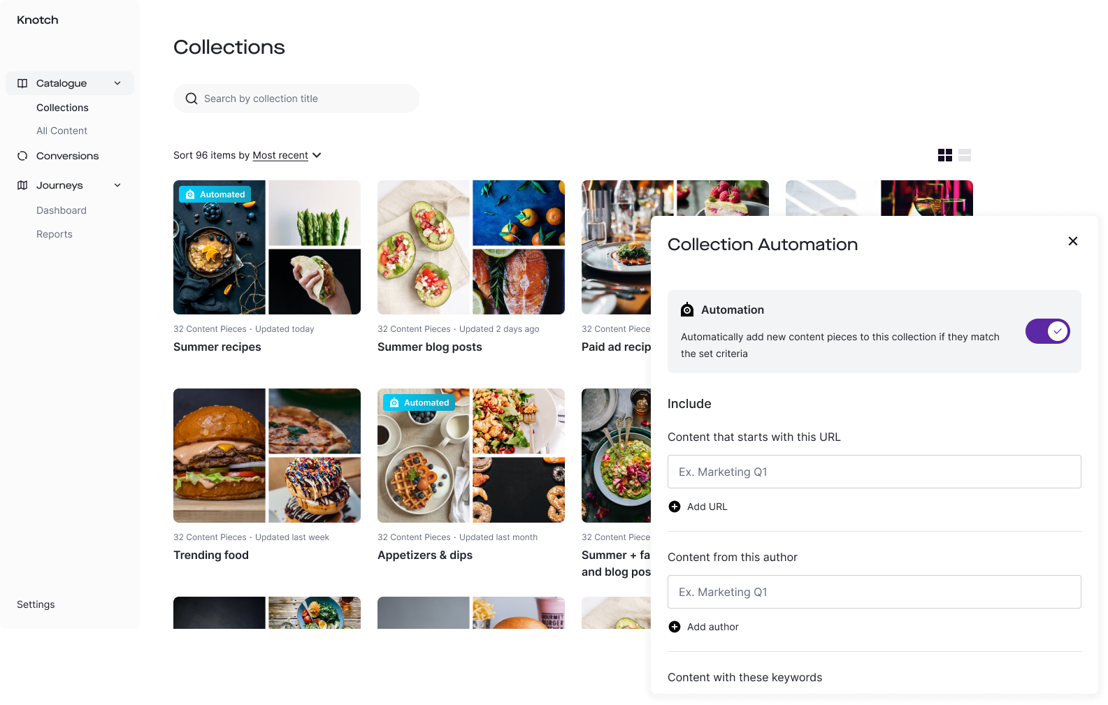
Any given site could host hundreds if not thousands of content pieces, so users needed a way to quickly browse an organization's library and drill down when necessary. With input from the product team, I developed a view for all content, with filtering functionality that reflected how users searched for their content pieces.
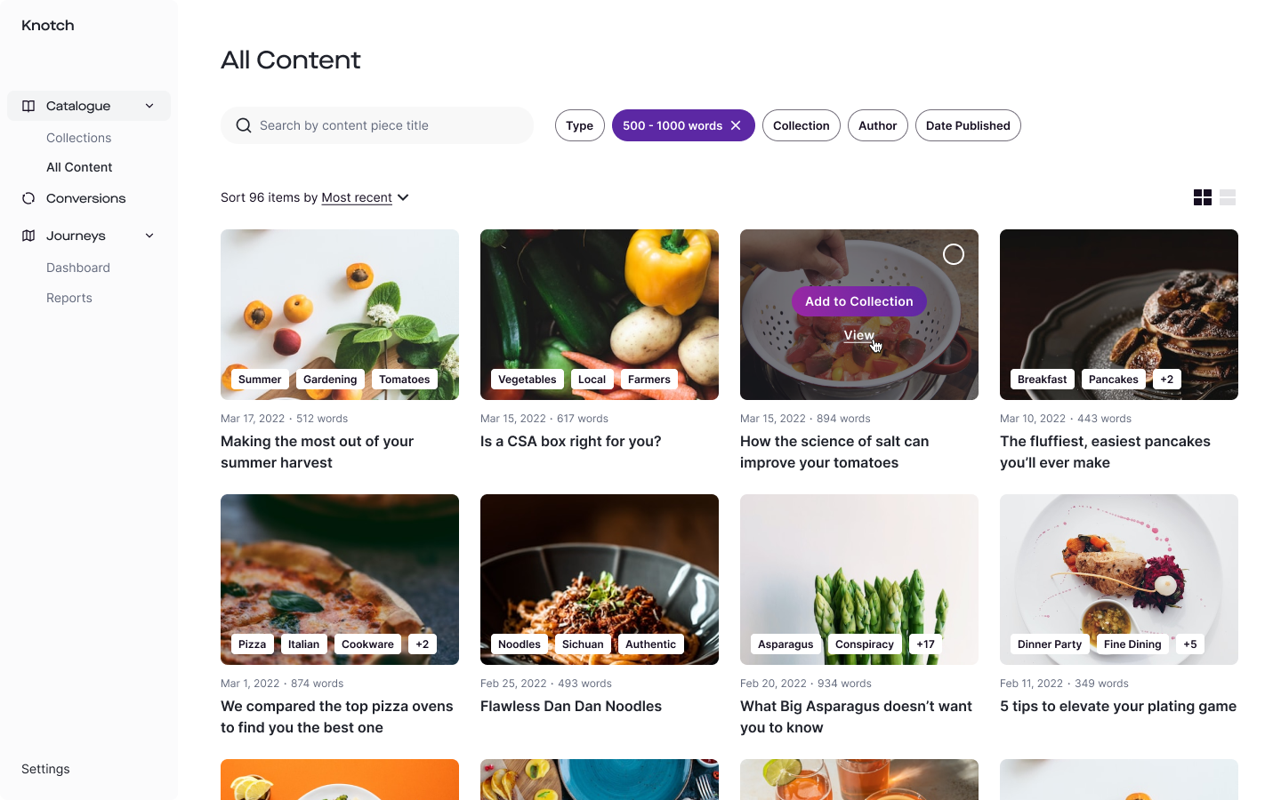
Users also needed a way to group content together, not just to organize it but to be able to run reports and glean insights on similar types of content. We knew how tedious it would be for organizations with large content libraries to manually create collections, so included streamlined automation functionality to take care of the bulk of the work.
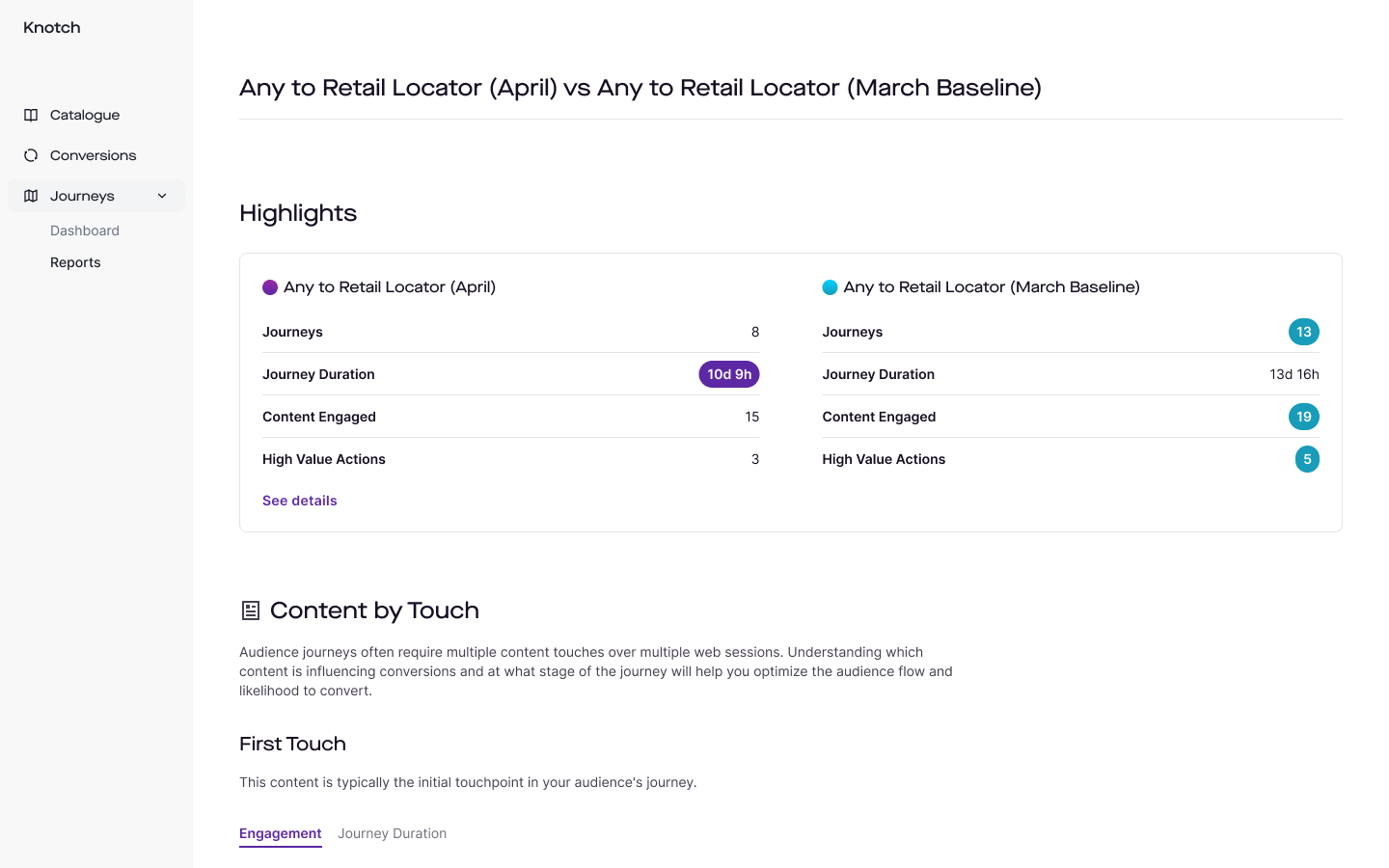
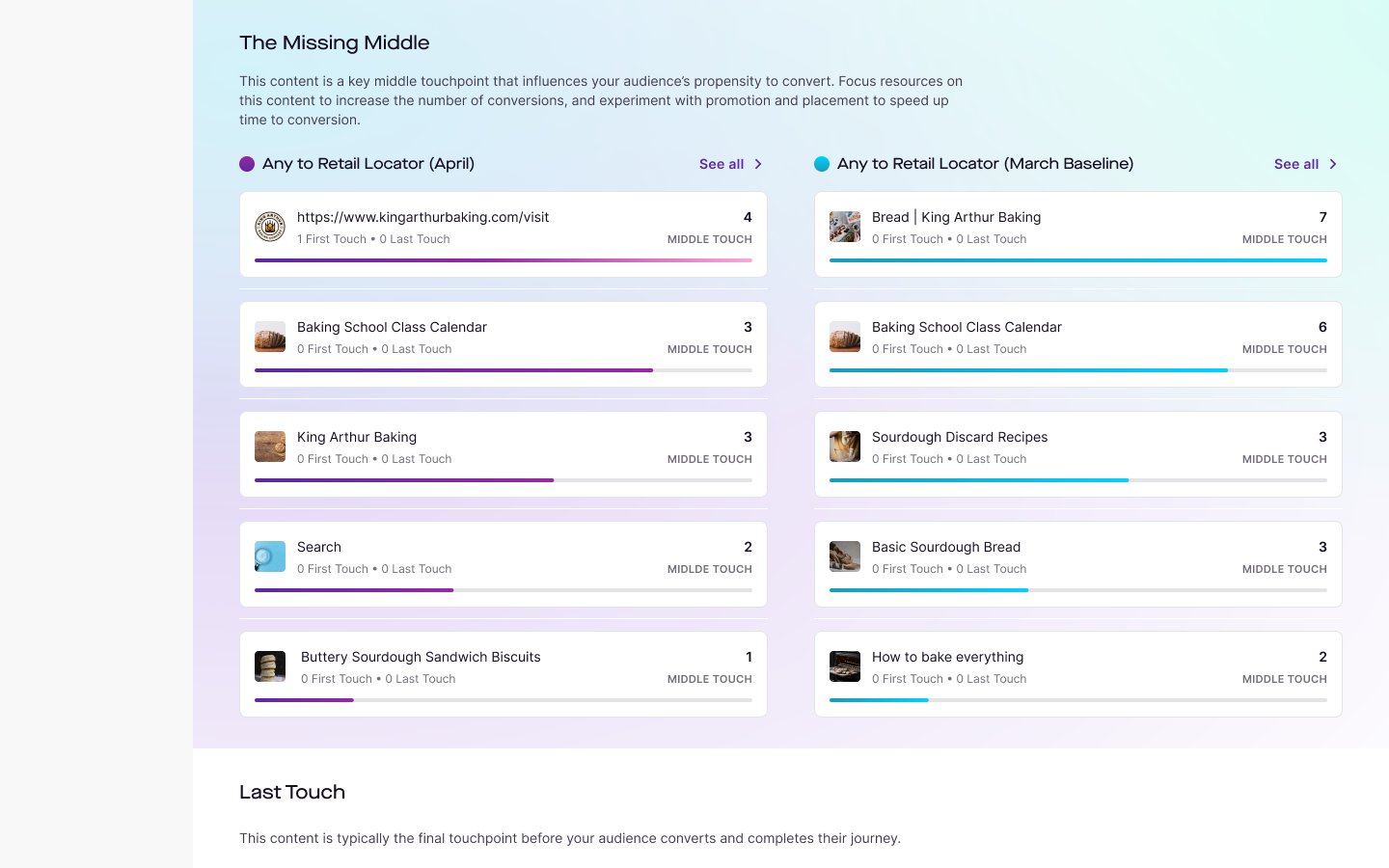
Once users had all of their content accounted for on the platform, they needed to be able to run reports highlighting top performing content, conversions, and high value actions (ex. requesting a software demo). One version of reporting is the Audience Journey Comparison Report, where orgs can compare the performance of two different content collections.
This page doesn't cover a slew of other projects such as journey visualization, report generation, content details page, the hundreds of additions to the component library, or the design philosophies and processes that were implemented along the way. It was a pleasure being able to help bring this all to life.
This applies not only to customer-facing features but also internally. In the same way it's hard to tell if a flow is going to be intuitive to a user, it's hard to tell if your component will be flexible enough for all use cases until you start dragging it into your file. And that's fine, as long as you're quick to test and iterate.
I'd worked on design systems before, but this was my first time completely owning one from start to "finish" (again, the work never really ends). For every addition to the system, my design colleagues needed to know how a component worked, and the engineering team needed to know how they should implement it. And neglecting to write anything down lead to a lot of questions and breakdown. Just document your work.
Back to top